Close
Showing results 1 to 7 of 7

Thread: TO MAAT

Hybrid View

  1. #1

    Default TO MAAT

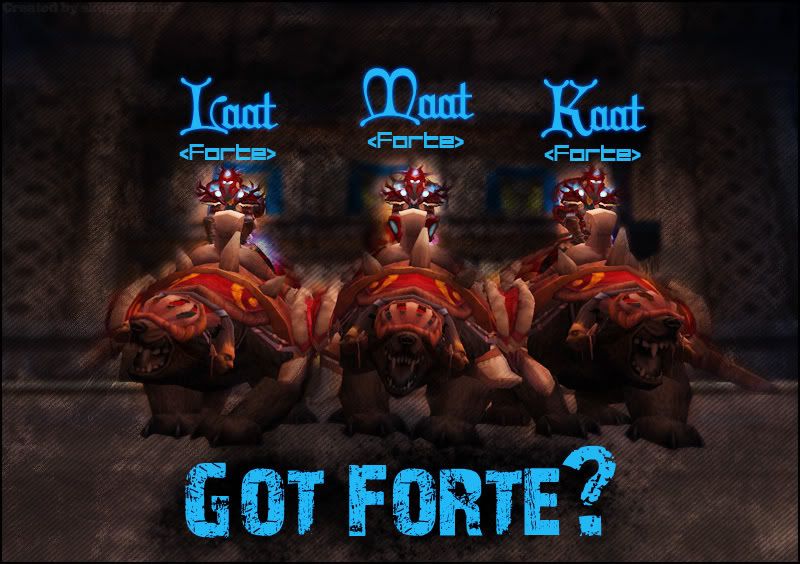
    I saw your pic that you posted with your bears and thougt, daam that pic is to nice not to screw with it XD

    So i fired upp Photoshop (yet again) and hers what came out...


    Hope you like it and dont mind that i stole and raped your SS:


    Tweaked it a bit


    REMEMBER to save the pics and host them yourself!
    Signature edited by Svpernova09

  2. #2
    Rated Arena Member
    Join Date
    Feb 2008
    Location
    Budapest Hungary
    Posts
    126

    Default

    I liked it. :P

    Here are some feedback from our guild forums:

    think it looks really pro!


    makes me want one day to also try out dual-boxing

    EDIT: was thinking of a new phrase, dunno if its too long, but:
    "Lightning Overload Guaranteed!"
    haha quite pro, would maybe make the bears a bit sharper but other than that cool.
    font for the names is awful
    the Name font is crap imo (and 3 different kinda font on the same picture? o_O, not pro aswell), bit hard to read.

    the "dirt" layer is too dark, compare to the masked character layer, it's forcing your eyes to the shamans, instead of just focusing on them (REALY! annoying). This makes the picture a bit crap. Reduce this "dirt" layer's opacity, and mask the shaman's curve again, with a much larger brush.

    Or maybe redesign the whole picture, and try to find an other way to bring the shamans in to the front.
    Kaat/Laat/Maat <Forte>@EU-Boulderfist(very old team)
    CalebX/CalebY/CalebZ/CalebW@EU-Tarren Mill(rank1 in 5v5 )(shaman pvp team)
    Maata/Maatb/Maatc/Maatd@EU-Tarren Mill(old pala pve team)
    Calebpa/Calebhu/Calebhh/Calebhg/Calebd@EU-Draenor(current pve team)
    CalebV<Ensidia>@EU-Tarren Mill (quit hardcore PvE)

  3. #3

    Default

    Nice feedback i thougt the name font was ok exept for the L in Laat, that one was messed upp.

    I tryed making the bears sharper, didnt work out that well, to much diference betwen them and then backgrund.

    I saw it later on that the dirt layer was to dark XD, also dont think the outlines of the shammys are to great :S
    Signature edited by Svpernova09

  4. #4

    Default

    Cool pics
    <Autobots Roll Out>
    Outland EU Alliance Multiboxing Guild

    Glows Movies @ WCM
    Movie account stats: ~300 000 views - 4.69/5 rating

  5. #5

    Default

    Hell yeah bro you think you can teach me the ways of the force with photoshop. If any of you are interested in getting Adobe Creative Series CS3 for free hit me up on pm.

  6. #6
    Member Tdog's Avatar
    Join Date
    Mar 2008
    Location
    In 5 places at once...
    Posts
    1029

    Default

    I like the pics man! I do agree with one piece of criticism though that 3 font types seem to be a bit too much. Might try making the names and the caption the same font. Other than that it's damn nice work imo.

  7. #7

    Default

    nice work what is the font you used?
    Shockin Shocked Shocka Shocko


Similar Threads

  1. Replies: 6
    Last Post: 08-20-2008, 08:50 AM

Posting Rules

  • You may not post new threads
  • You may not post replies
  • You may not post attachments
  • You may not edit your posts
  •