
the drop is just crazy


the drop is just crazy
and yet i have less money then i did in 1987 GO GO ECONOMY
Feel the power, love the power!!!! and I Ji?? in my pants

I'm not sure what your point is...
Owltoid, Thatblueguy, Thisblueguy, Otherblueguy, Whichblueguy
my point? basically... 8|

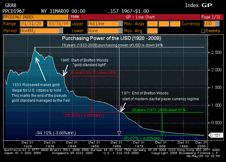
This is because inflation. A low, steady inflation rate is good for an economy. We have been pretty good at this since around WWII. Deflation, no inflation, or a high inflation could be very bad. Notice how the peak of the USD purchasing power was right in the great depression? Sure in a few decades a candy bar might cost $5 but people will also be making $100 an hour.
Prot Paladin, tank/resto Druid, 2xResto Shaman, 3xElemental Shaman, Balance Druid, Shadow Priest, Arcane Mage PVE
10x shamans PVP

If you check how much you're making now vs 10 years ago and how much you can buy in Europe for that amount for instance you'll see the dollar and how much you're worth went down; ie to take the example above, a candy bar maybe going from .25 to $5 while salary go to $10 to $100 is NOT a good deal :-) [well it is a good deal for foreign investor/real estate buyers]
2,3,5 boxing wow with Wow Open Box and MAMA, give them a try!
(was 8 Boxing Wow with HotKeyNet and ISBoxer)
Was streaming on twitch.tv/MooreaTv
Yeah, as a poker player from outside the US, I can really feel the decline of the USD. Made the switch to Euro a few months ago. I could be winning the same amount per month as normal, but the profit went down because of the damn weak dollar.
<Cult of Peritaph>
Stolas Prot/Retri Paladin
Turenn Prot Warrior
Myrtqs and Myrtus Elemental Shamans
Loretta Moonkin
Myrtus Restoration Shaman
Level 80

Well, that graph says nothing about international exchange rate, just the purchasing power has dropped in the last century. The steady decline is mostly an indication of growing wealth across the whole populace. All you can really garner from just that single graph is that the people have gotten more wealthy, hence less purchasing power per dollar bill. If you start reading too much into it, you'd think everything was going downhill since the Great Depression.
If the value didn't drop while wages increased, then everyone in the country should be living in mansions right now. The best way to stop the decline in purchasing power is to stop wage increases.
Duskwood - Alliance - PvE
Wage increases are just a byproduct of increasing commodity prices and the Fed printing money as fast as the market will accept it. The best way to stop the decline in purchasing power is to go back to the gold standard or tie our currency to some commodity. As long as we have the monetary policy that encourages moderate inflation, and views deflation as almost a big of risk as hyper-inflation, you will continue to see this graph go down. I asked Keyclone what his point was because this graph doesn't tell a whole lot about standard of living or what purchasing power the average American has (if purchasing power decreases but income doubles, then the only people who get screwed are the debtors... which just encourages people to take on more debt which can lead to an extremely dangerous cycle).
We'll never go back to the gold standard (without a revolution of sorts) which means that we'll have inflation and continue to see the purchasing power of the dollar decline. Why would the Fed, a private corporation, give up so much power willingly? As the infamous Rothschild quote goes, "Give me control of a nation's money and I care not who makes the laws."
Owltoid, Thatblueguy, Thisblueguy, Otherblueguy, Whichblueguy
 Posting Rules

 Reply With Quote
Connect With Us